







Client
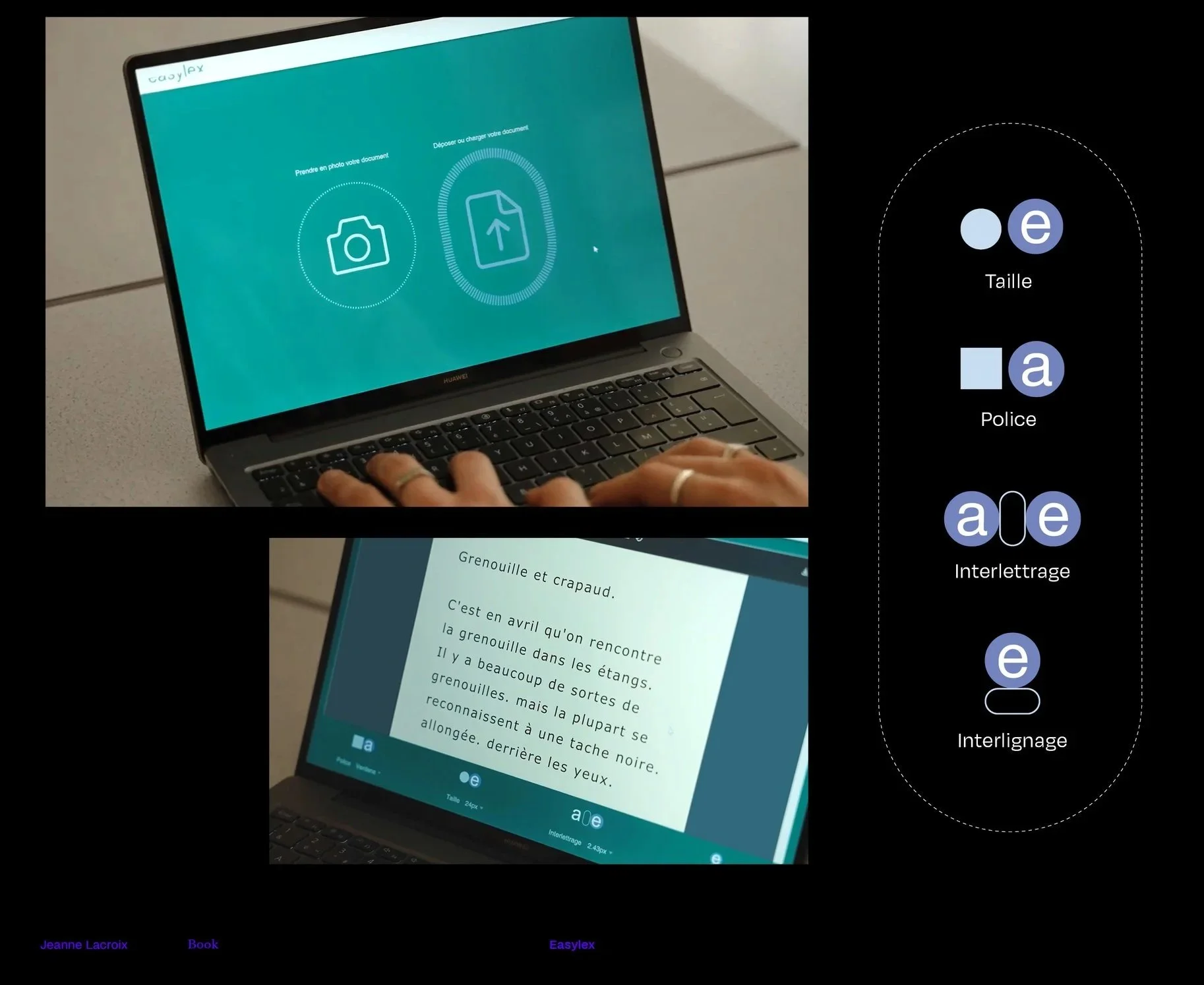
Easylex is a web-based reading aid for people with dyslexia: it converts a photograph of a paper document into a digital document with an adapted layout. The aim is to make reading easier by improving users’ reading comfort and speed.
Concept
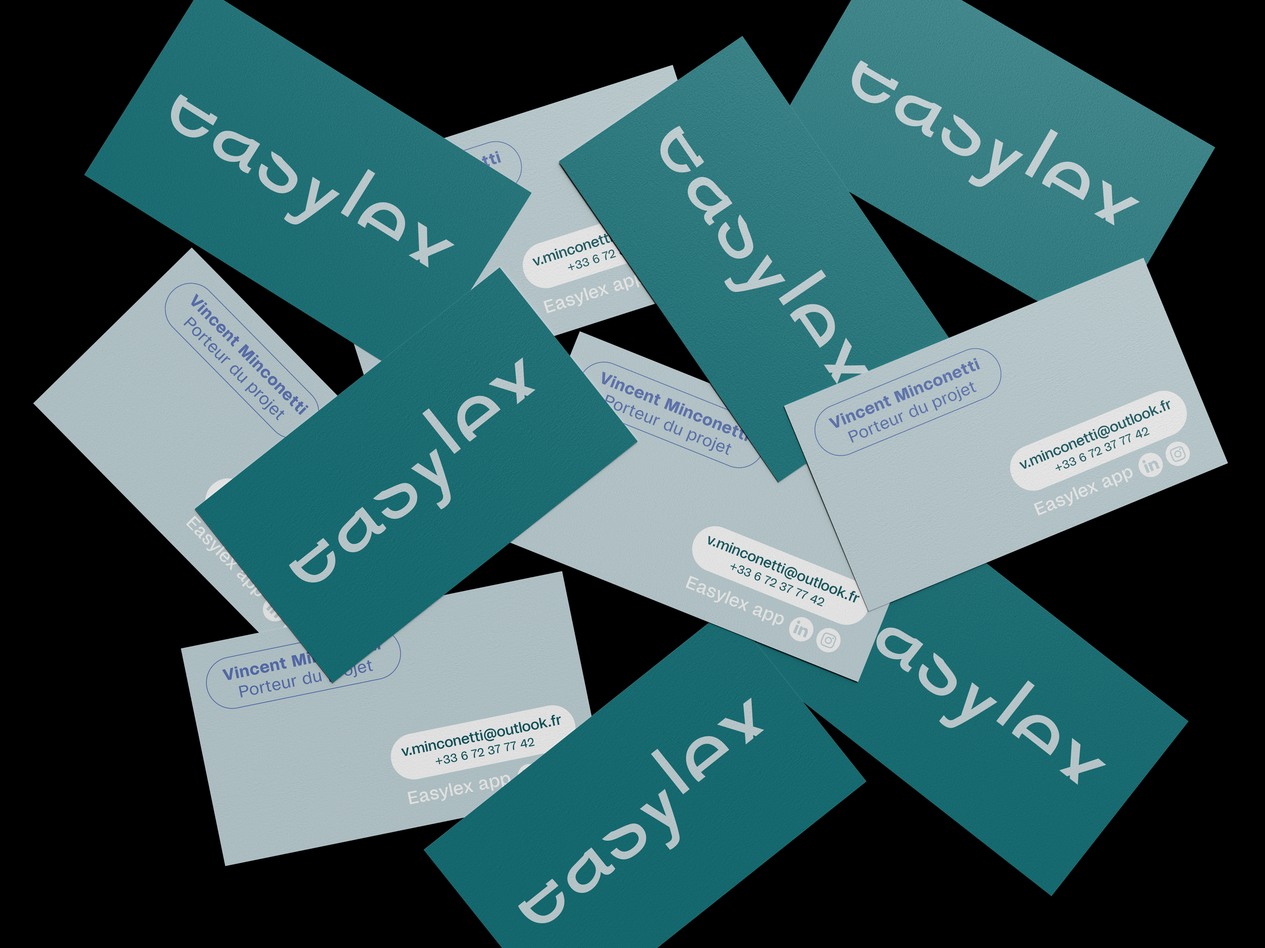
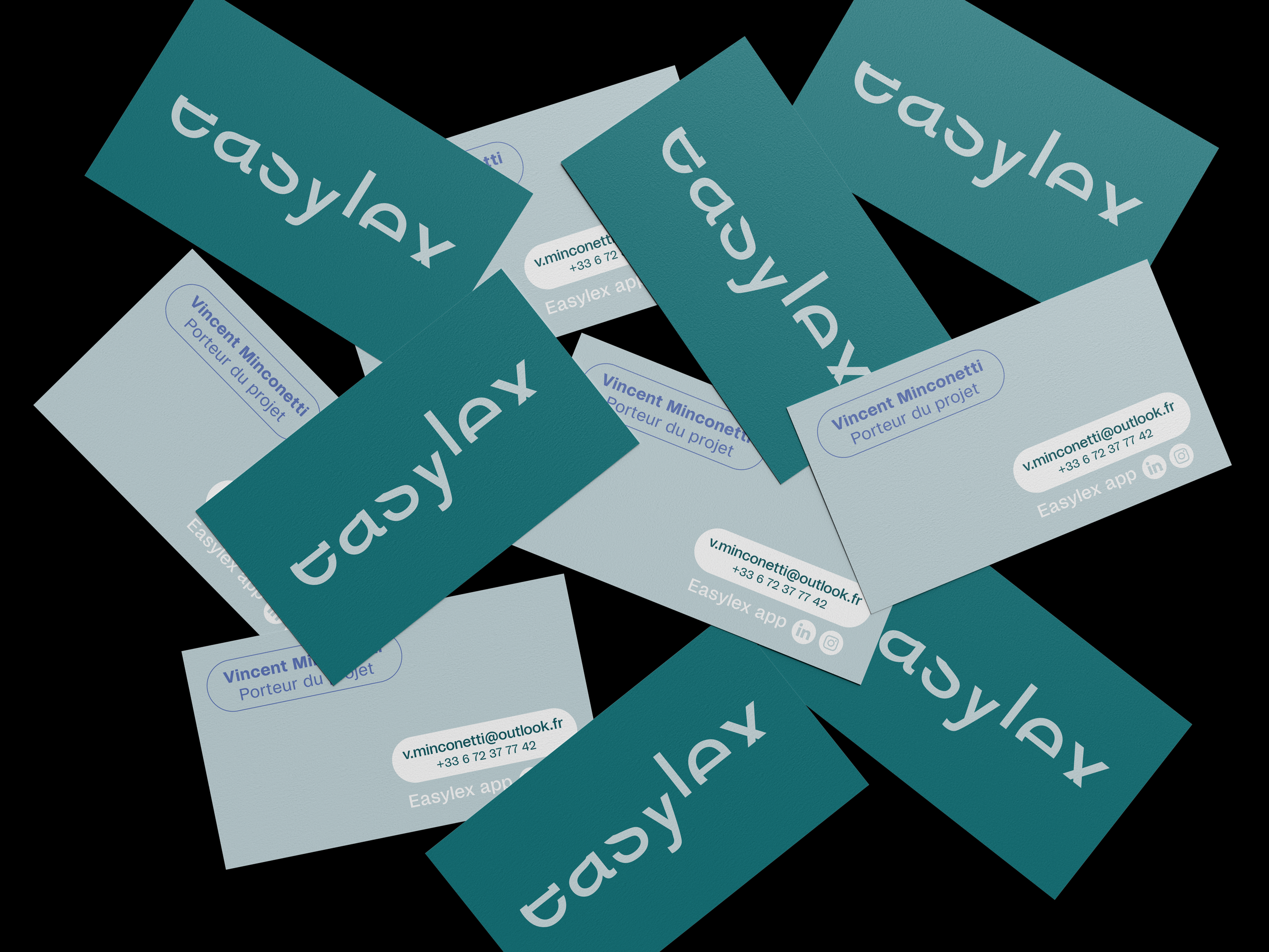
Because typography lies at the heart of the Easylex project, its logo is based on text. The text becomes an image, illustrating the experience of people with dyslexia. It seeks to embody dyslexia and serves as a tool for raising public awareness. The logo plays on partially obscured typography. A mask disrupts the reading flow and creates a visual shift. Despite the letters being cut off, the word remains legible. The Easylex brand identity consists of just three colours. Soft in tone, they are suited to a child audience and provide the contrast needed for people with dyslexia to see clearly. Helvetica is recognised as a typeface that makes reading easier for people with dyslexia, so the logo has been designed using this font. A sans-serif linear typeface, it was created with a specific aim in mind: to produce a font with the most harmonious, legible and neutral lines possible.
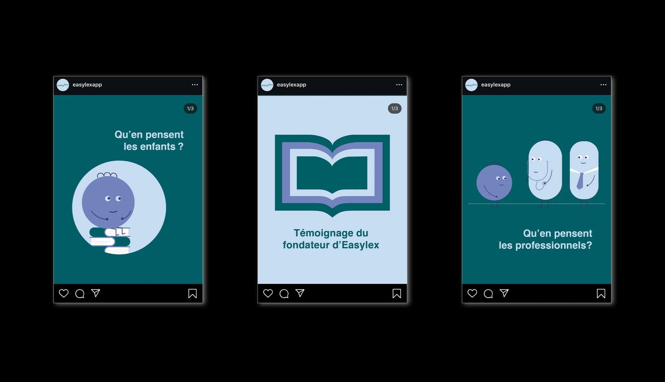
The brand identity features a visual style rich in vector illustrations. With their rounded shapes, the illustrations help to create a playful and warm visual identity. Children can also identify with the purple character, a recurring element.
Easylex
dyslexia & graphic design
artistic direction
✺
poster
✺
illustration
✺
visual identity
✺
editiorial
✺
animation
✺
artistic direction ✺ poster ✺ illustration ✺ visual identity ✺ editiorial ✺ animation ✺